
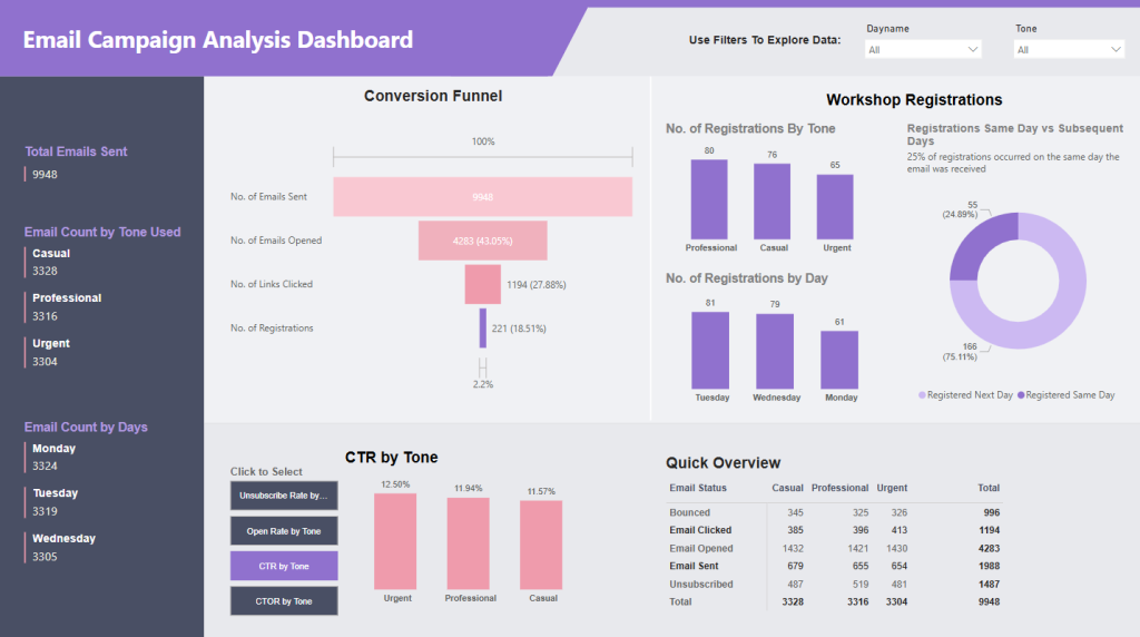
Here’s a Power BI Dashboard I created to analyze an email campaign promoting a free workshop, focused on testing the effectiveness of different email tones. In total, 9,948 emails were sent, using a combination of three tones: Professional, Casual, and Urgent. The campaign ran over three consecutive days, with an equal distribution of tones each day. This dashboard reveals insights into how each tone performed and identifies the day that yielded the highest workshop registrations.
Leave a Reply